A Look at Graphics: Other Dimensions
A Look at Graphics
Acclaimed artist Ben Chandler shares his expertise in designing adventure game graphics.
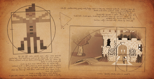
It's a standard feature of adventure stories to show a wide range of settings over the course of a tale. Dark forests, scorching deserts, snowy mountains, gloomy castles – it's perfectly common to jump from one to the next as the hero's journey advances. Sometimes, though, the story requires that the hero travels not just to a new area, as it were, but another reality, a separate dimension, or perhaps an altered perception of a place. Communicating this transition through visuals requires a different approach than showing the change between suburbs, climates or biomes, and the techniques used can vary depending on exactly what this change is, and what the writer is trying to communicate.
(Click any image for a larger version)
In the Blackwell series, Rosa's efforts to help the deceased move on saw her traveling with them for the first step of the journey to 'nodespace', a writer's impression of the entrance to the afterlife. It's fairly obvious that the rules of physics have changed just looking at this comparison – from the fairly mundane, realistic appearance of New York City and its various boroughs to a mystical zone of glowing, white light, floating rocks, and even a shimmering portal that appears to lead to nothing. It's easy to see that these characters aren't in the corporeal realm anymore when visiting this place.
For Technobabylon, James Dearden had a specific vision of how cyberspace should look compared to 'meatspace'. Not only did the environment art change completely from solid, physical walls to glowing, abstract shapes, but the characters changed entirely, too, into idealized/humorous/glitchy avatars that represent their online presence. This was heavily inspired by the use of profile pictures on the Internet, and the wide variety of images these can include, which allowed for some very odd designs to be used in Trance-based areas.
For Shardlight's hallucinogenic vision sequence, I tried something different yet again. Here you can see elements of the real world relocated into the character's vision – particularly the bench and the doorway. The rest of the details have been replaced with an impossible landscape and symbols related to other elements in the story, and the colour scheme changed completely, but this allowed us to have the character begin the dream on the same bench she passes from the real world, and to walk through the door in the dream to re-enter reality, a nice way of connecting the two phases of the story.
One of the simplest ways to turn a scene into something more surreal and otherworldly is a colour change. The bold red colour that this scene from Monkey Island 2 takes on in Guybrush's vision is not only immediately indicative that things aren't normal, but also gives the whole scene a macabre vibe that matches the dancing, singing skeletons of his parents perfectly. Nothing else needs to be altered to feel surreal when a colour scheme change is this violent.
Beneath a Steel Sky's colour shifting between worlds is sometimes a little more subtle, but still uses deep, saturated colours in LINC that contrast nicely with the fairly drab, earthy tones of the real world. Here the addition of surreal decorations – such as platforms floating in mid-air and a giant eyeball – add a lot to the idea of visual representations of abstract concepts like software and data. The transformation of Foster to a generic, nude avatar helps complete the effect, making him appear literally disembodied and merely using this visual construct as a means of representation in this other place.
Such abstractions can be used to quite meta comic effect. In this example, Roger Wilco's adventures through time periods in Space Quest IV take him back to the first game in the series, which is especially evident due to the fact that the background shifts in style to look more like the art from that game, done with fewer colours and much less detail. This is a medium-specific approach to the idea of time travel, and serves as a fun and memorable gag.
Sam & Max Hit the Road does something slightly similar – here Sam's foray into the world of virtual reality is represented as a comical, angular vision of wonky shapes that move in odd ways. It feels like the designers were using this to poke a bit of fun at the idea of escapism in games, particularly the simplistic 3D experiences that were possible with the technology at the time. The fact that it shows Sam's actions back in meatspace adds to the moment, with his movements, when taken out of context, being a bit more fun at the expense of virtual escapism.
Telltale's Sam & Max Save the World does something similar, to an entirely different effect. Here, the area around their office is virtualized, the characters becoming digitized versions of themselves, representing the idea of websites being a replacement for actual stores, and the like. We can see the online version of Bosco's Inconvenience, with the placement and design of elements being similar enough that it's easy to tell that this isn't escapism into some fantasy world so much as an electronic representation of the real world.
The Longest Journey's premise is quite different to this idea of another dimension being a source of comedy or representation. We're asked to take the worlds of Stark and Arcadia seriously, with both being living places in the story. Here the elements that define each world – the technology of Stark and magic of Arcadia – are used by artists to show the difference between the two. Defining these worlds this way in the narrative provides a great tool for defining them separately, in colours, forms and designs.
Another great example of an interesting approach to playing with other worlds is in Grim Fandango, where the surreality of the Land of the Dead is wonderfully juxtaposed with a representation of the mortal realm that's even more grotesque and surreal. A beautiful subversion of the idea of the afterlife being more horrifying than our own, this visual parody of humanity's world is both unique and unforgettable. Next to this distorted scene, the rest of the game looks quite normal and stable, giving some context to the characters’ perception of our lives.
Another example of contrasting a surreal setting with an even more surreal one is the dream sequences in Dropsy. Here the game's strange, abstract vision of the world is replaced with a more unsettling, violent version, with elements appearing across worlds being more distorted and twisted in these dreams. A chilling, powerful visual effect. Notice that here, as in Monkey Island 2, the colour red is used to great effect, amplifying the creepy feeling at a glance, even before we have a chance to take in the details.
Another fun example is the representation of cyberspace in else Heart.Break(), which has the added challenge of presenting a setting in which the lines between the real and the digital have been blurred. In a town like Dorisburg, where you can hack a cigarette to speed up time, or a coffee to make you more beautiful, the bright, abstract forms that the game uses fit very well. When strange, glitchy patches of the world appear, it's clear that there's a bug in the system somewhere, but it still feels like part of this same style. By the time our hero can travel to cyberspace itself, representations haven't changed that much in colour – the bright pinks and yellows of the main game still remain, it's just that the details have been stripped away further, so that the geometry is more abstracted. It still feels cohesive, though, and even a real world door doesn't feel that out of place in the virtual world due to the colours used throughout the game.
There are many ways to show these ideas in games. Whether we're entering a parallel universe, a representation of a character's mind, or a digital world existing purely in code, there are a lot of fun ways to show this shift from one reality to another. This can add memorable moments, both narratively and visually, and give us fascinating new places to explore. The very act of shifting between two worlds itself can be memorable, too, but is much harder to explain here. The two worlds shown from Obduction above are both beautiful, and worth admiring, but the jump between the two is something that no screenshot can do justice to, and is worth experiencing in motion – a truly magical, captivating shift to another dimension.
Ben Chandler is an acclaimed adventure game artist and designer who now works with Wadjet Eye. If you enjoy his freelance article series at Adventure Gamers, we encourage you to check out his equally insightful blog about art in games.




![Event[0] - Game Review](https://cdn.nivoli.com/adventuregamers/images/screenshots/31241/image001__medium.jpg)
