Adventure Gamers - Forums
You are here: Home → Forum Home → Gaming → Adventure → Thread
Post Marker Legend:
-
 New posts
 -
 No new posts
Currently online
Mystery Game X - Gabriel Knight: Sins of the Fathers, 20th Anniversary Edition

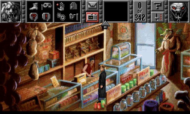
It’s not that bad, but somehow the location looks more “tiny” and the color palette is different:
Recently finished: Four Last Things 4/5, Edna & Harvey: The Breakout 5/5, Chains of Satinav 3,95/5, A Vampyre Story 88, Sam Peters 3/5, Broken Sword 1 4,5/5, Broken Sword 2 4,3/5, Broken Sword 3 85, Broken Sword 5 81, Gray Matter 4/5\nCurrently playing: Broken Sword 4, Keepsake (Let\‘s Play), Callahan\‘s Crosstime Saloon (post-Community Playthrough)\nLooking forward to: A Playwright’s Tale
uhhhhhhhh…. dont like!!!!!!!!
they need to ease up on the haunted house vibe on every single background.
I hate the current trend that all “serious” games have to be in drab colours (and comedy adventures being “wacky” by going crazy with their palettes). You can barely even see the alligator statue in the new version.
The perspective on that remade graphic looks bizarre; the hanging gris-gris bags in the foreground of the old one really make the screenshot standout.
I hate the current trend that all “serious” games have to be in drab colours (and comedy adventures being “wacky” by going crazy with their palettes). You can barely even see the alligator statue in the new version.
I have commented in other threads about the “darkness” of so many adventure games that have been released in the last decade. Dark, not only in terms of subject matter, but also in terms of color palette.
That said, both Diego and Zane uploaded the same screenshot, and Zane’s is a bit “lighter”. I wouldn’t even notice the alligator statue in Diego’s shot, but I can clearly make it out in Zane’s.
While I’m not going to put in the effort, my guess is that you could Photoshop the screenshot and bring it close to the color palette of the original. I don’t know whether this darker palette is of JJ’s choosing, or whether it is the way the game’s concept art got translated into publishable screenshots. If the former, I hope she decides to “lighten up a bit.”
For whom the games toll,
they toll for thee.
That said, both Diego and Zane uploaded the same screenshot, and Zane’s is a bit “lighter”. I wouldn’t even notice the alligator statue in Diego’s shot, but I can clearly make it out in Zane’s.
im afraid that must be an illusion created by your browser somehow, because i quoted the picture right from diego’s post ![]()
That said, both Diego and Zane uploaded the same screenshot, and Zane’s is a bit “lighter”. I wouldn’t even notice the alligator statue in Diego’s shot, but I can clearly make it out in Zane’s.
im afraid that must be an illusion created by your browser somehow, because i quoted the picture right from diego’s post
The apparent brightness of an image on an LCD monitor is affected by the angle you’re viewing it at. So if one image is higher or lower, or if you move your head, it can impact the brightness. That’s probably what created the perceived difference between the two images even though they’re actually the same.
Yeah, I totally agree about this shop screen. Completely different vibe from the original, and not in a good way. If this whole game is going to have the stock “Dark & Gritty TM,” color palette, it’s going to get old fast.
I just hope they keep in mind, a big part of what gave GK1 a spooky creepy atmosphere, was how normal and friendly most of the city looked… and the unfolding events contrasted against that.
Locations really dont need to be “spookie-fied” like that shop screen is looking.
So the question becomes . . . why did the remake team go more photoreal? You suggest, Orient, that it’s because GK1’s original art was intended to be more realistic in style, but the limitations of the time didn’t allow it to be, so the remake team is fulfilling what the original game could not. But I don’t know of any evidence for this. In the old Making of Gabriel Knight video, they discuss the game’s graphic novel inspirations (as I’ve also demonstrated above), and indeed the original game art succeeds quite well at looking like a graphic novel, aside from being pixelated. The limited color palette of the time is perfectly sufficient for creating inky blacks and rich colors.
I have no doubt that Jane Jensen partially chose this art-style because it’s something that Pheonix Online are good at. However, I’m not sure I agree that the original game succeeded in looking like a graphic novel. As someone who’s not particularly familiar with the game, I didn’t get that impression at all from looking through screenshots. The promotional materials? Sure. But the backgrounds, not so much. Apart from that one scene with the stained glass window, I wouldn’t describe it as a game with rich colours at all. If anything, the palette is quite subdued, and the lighting fairly realistic if a little exaggerated. There’s a lot of purple, I guess, but the backgrounds are very detailed, in a way that I do not associate with graphic novels.
I guess we can agree to disagree. Regardless of whether this new style is truer to their original intention, it’s something that Jane has chosen, and you can’t please everyone. If this remake looked more like The Wolf Among Us, you’d get just as many people complaining.
What I’d really like to know and wasn’t even brought up in the interview: the original game had the Sierra issues, i.e. deaths and dead ends
They better not take out those deaths. They were one of the most fun parts of the game for me.
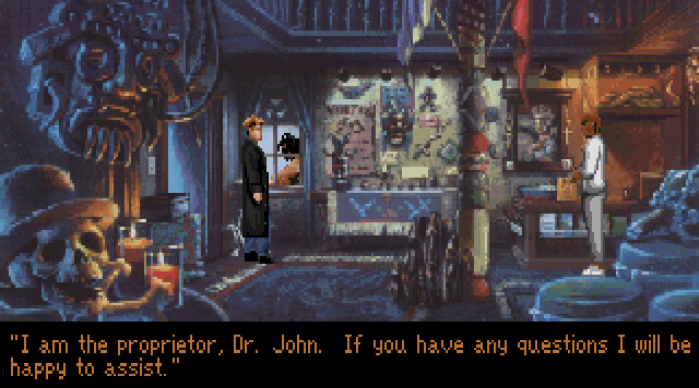
I loved to find new ways to get Gabe brutally killed. (Dr. John taking out Gabe and Mosely in the back room of the Honfour is my favorite) And they always let you try again from the moment you messed up anyway, so I don’t see why anyone would have a problem with them.
And there’s only one dead end that I know of. And that can very easily be fixed by having Gabe mention that he needs to leave something behind for Mosely.
I’m assuming the game will give players that are stuck a lot more hints along the way than the original game. But from the FAQ it sounds like most of the gameplay and puzzles will be exactly the same. And that’s a good thing, because the game really is fantastic as is.
I just hope they keep in mind, a big part of what gave GK1 a spooky creepy atmosphere, was how normal and friendly most of the city looked… and the unfolding events contrasted against that.
Locations really dont need to be “spookie-fied” like that shop screen is looking.
Very true. Evil hiding in plain site is a big part of what makes the game so unsettling.
I’m a huge fan of Gabriel Knight, and I’m definitely excited about this remake. I’m not too concerned about the new voice work. Actually, I really liked the versions of Mosley and Grace in GK3 (particularly Charity James as Grace), and both of those were new voices. A lot of it, of course, will depend on Gabriel’s new voice, and hopefully they find someone who can do that character justice.
I am also excited about the new, extra content that is being added. Plus a remastered soundtrack? Awesome!
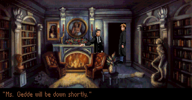
However I’ve found the new graphics (at least of what has been shown) to be a bit of a let down. For me, it’s not so much the new color palette or the photorealism, rather it’s the composition of the new scenes which I don’t think quite hold up to the original. I loved the widescreen cinematic feel of GK1, with the great foreground art and framing of each screen, ie:

The new art, with its 4:3 dimensions, just doesn’t have that same cinematic feel. I wonder if they’ll provide the option of widescreen?
Anyhoo, that’s my one gripe, otherwise I’m very excited about this!
However I’ve found the new graphics (at least of what has been shown) to be a bit of a let down. For me, it’s not so much the new color palette or the photorealism, rather it’s the composition of the new scenes which I don’t think quite hold up to the original. I loved the widescreen cinematic feel of GK1, with the great foreground art and framing of each screen
I’d also point out that a lot of the backgrounds in the original were from a very level angle (which I notice now from your screenshots - earlier I just saw it in the church scene). It’s also part of the cinematic feel (and just a more natural feel, being more dynamic). This time, they’re going a lot more from a high angle - it’s much more gamey and just more conventional - and so duller.
They’ve been posted so many times already, so I won’t spam with them again but just look at the church scene. The original, from a low angle feels much more dynamic. That’s not to say the new one is bad, just that it would be better from the same angle. Such little things have a great impact on the feel of the scene and even the game.
Hopefully it’ll turn out to be just the church scene, though ![]()
I’m not too concerned about the new voice work. Actually, I really liked the versions of Mosley and Grace in GK3 (particularly Charity James as Grace), and both of those were new voices. A lot of it, of course, will depend on Gabriel’s new voice, and hopefully they find someone who can do that character justice.
I wouldn’t be too concerned, either. I mean, Jane’s heavily involved, and I doubt she’d let in voice actors who couldn’t portray the characters in their essence.
WAY too dark. The original graphics were pretty much spot on for real-life voodoo shops. That realism is lost here. Who would buy something from a shop where you can’t even see any of the items for sale?
I’m fine with most of the other redone screens, though. The shop, the park (despite that feeling a bit small if Gabe is the size depicted on that shot), the Schloss Ritter chapel, the cemetary, those all look gorgeous.
I’m not as bothered by the departure from a more graphical novel style. That was only really visible in cutscenes anyway.
Not having widescreen graphics doesn’t bother me either. So what if I’ll have black bars on the sides? I didn’t have any problems with the original 640x480 resolution, so another 4:3 ratio will be just fine. Besides, it’s obvious they’re aiming for iOS/Android success too.
No need to be overly critical yet, imo.
The truth can’t hurt you, it’s just like the dark: it scares you witless but in time you see things clear and stark. - Elvis Costello
Maybe this time I can be strong, but since I know who I am, I’m probably wrong. Maybe this time I can go far, but thinking about where I’ve been ain’t helping me start. - Michael Kiwanuka
No need to be overly critical yet, imo.
Very true ![]() Of course, people want to discuss anything they can about it, and so far this is all we have
Of course, people want to discuss anything they can about it, and so far this is all we have ![]() So it tends to always get more critical than people maybe even mean, in such a point…
So it tends to always get more critical than people maybe even mean, in such a point…
the park (despite that feeling a bit small if Gabe is the size depicted on that shot)
Right. Mind you, Jackson Square isn’t huge, but it’s certainly bigger than that ![]() Looking at it in Google Maps...
Looking at it in Google Maps...
You are here: Home → Forum Home → Gaming → Adventure → Thread
