Adventure Gamers - Forums
You are here: Home → Forum Home → Gaming → Adventure → Thread
Post Marker Legend:
-
 New posts
 -
 No new posts
Currently online
Day of the Tentacle Remastered announced!
I was hoping for something that would interpret the intent of the original art rather than just copy it as closely as possible with more pixels. For example, colored outlines in pixel art are a way of giving the impression of thinner lines, so using thinner, black outlines rather than thick colored ones would look more to me like what my mind imagines the high-res version to be.
That said, it could be a lot worse. Look at the first Monkey Island remake. So I’ll take it.
Someone that makes a version for modern systems will really have an easy time. Doesn’t have to change anything, just port it and and add some director’s commentary
Yeah. That, or:


![]()
Recently finished: Four Last Things 4/5, Edna & Harvey: The Breakout 5/5, Chains of Satinav 3,95/5, A Vampyre Story 88, Sam Peters 3/5, Broken Sword 1 4,5/5, Broken Sword 2 4,3/5, Broken Sword 3 85, Broken Sword 5 81, Gray Matter 4/5\nCurrently playing: Broken Sword 4, Keepsake (Let\‘s Play), Callahan\‘s Crosstime Saloon (post-Community Playthrough)\nLooking forward to: A Playwright’s Tale
This is VERY similar in style to what some fan art of DOTT did previously: (click for bigger size)
So, the remake is quite faithful to the original, but even though I’m an amateur when it comes to graphic design, I think it is obvious they DID use some kind of depixelization algorithm, like an advanced ScummVM filter, AND - reworked some areas by hand (because of imperfections, borders etc.). I’ll repeat - on the plus side, it is strongly faithful to the original, but on the minus side, it leaves something to be desired especially in the color shading sense: it is most noticeable in the large areas filled with exactly one shade of color, which is prominent now in the HD, and wasn’t while it was pixelated. For example:
The remake is almost “mathematically” correct when it comes to color borders (notice the elliptical borders at the bottom of the Chrono John, with little or no variety in the colors). I think it just needs more shading and detail touch-ups in order for HD versions to shine fully, especially when it comes to faces and design of 3 main characters. This is a very specific cartoon style, yes, and it doesn’t need to have details of Daedalic 2D graphics for example, but something along the line of Curse of Monkey Island would be perfect:

Notice how you almost can’t find the same color covering large spaces, like you can with the DOTT remake:
notice the same, one red shade on Betsy Ross’ dress, or on the flags…


I agree 1000%. You stole my thoughts. I respect their caution here, because if they made stylistic changes at all you’d never hear the end of it from certain fans (see: Monkey Island), but at the same time you lose something when you just treat it like an anti-aliasing filter. The depth to the materials is completely gone, and the pixels allowed our minds to fill in the rest. They implied certain textures. The shiny metal bottoms of the time machines is the perfect example. With these new graphics, those implications are totally gone and now they are flat. I think it looks and feels just like the original, which is probably good. But it’s not really inspiring me to play it again, and it’s not really reinvigorating my imagination in that world. I would rather see someone fill it out with more hand drawn rich texture and detail while still maintaining the cartoony look.
I feel like these studios never hire the right artists.
Larry Ahern and Peter Chan have been actully been involved in the making of this remaster, in a kind of an art director fashion. The devs talked a bit about it in DF forums as said that the new HR characters are based on new drawovers Larry did for them.
And they still do state this: ” We didn’t use any auto-vectorization tools or shortcuts to arrive at the final art. I am sure everyone will have their own interpretation for how to transform a handful of pixels into a full resolution piece of art, but the art we have created was done with guidance from the original artists by a team of artists who have a lot of love and respect for the original art.”
I don’t believe them. Look at this screen:

Is there any explanation for the text on the wall and the note other than auto-vectorization? Obviously they’re also going over it by hand and cleaning it up, but just as obviously they missed a spot there…
When that was pointed out, they said the BG’s not final yet and that it will get some text on it as soon as Tim figures out what.
But, you know, I don’t see why they’d be lying about it. Sure, the BG’s are propably done as vector art, that’s the simplest way of doing something like this, but at the same time, it doesn’t reguire an automated process.
What’s wrong with the text on the wall?
What’s wrong with the text on the wall?
The note in the middle. Now that it’s in HD and in bigger size, there should be some kind of text on it and not the pixelated lines that were in original representing some kind of text.
Recently finished: Four Last Things 4/5, Edna & Harvey: The Breakout 5/5, Chains of Satinav 3,95/5, A Vampyre Story 88, Sam Peters 3/5, Broken Sword 1 4,5/5, Broken Sword 2 4,3/5, Broken Sword 3 85, Broken Sword 5 81, Gray Matter 4/5\nCurrently playing: Broken Sword 4, Keepsake (Let\‘s Play), Callahan\‘s Crosstime Saloon (post-Community Playthrough)\nLooking forward to: A Playwright’s Tale
After experimenting with VectorMagic (one of the best tools on the market, I believe), I agree that they haven’t used any automatic vectorization tools. In practice you get too many artifacts, and the edges are too “wobbly”: you’d have to redraw pretty much every curve anyway. It’s just not worth it.
What’s wrong with the text on the wall?
The note in the middle. Now that it’s in HD and in bigger size, there should be some kind of text on it and not the pixelated lines that were in original representing some kind of text.
it’s a case of being too faithful to the original? ![]()

The VITA Lounge - a PSVITA site has an excellent article on the game that is coming out on the PS4 and PSVITA next year:
http://thevitalounge.net/2015/10/26/double-fine-debut-day-of-the-tentacle-remastered-screens/
I found it to be interesting reading, the game should be a great play like Grim Fandango Remastered was on the PSVITA.
I enjoy playing adventure games on my Alienware M17 r4 and my Nintendo Switch OLED.

What’s wrong with the text on the wall?
The note in the middle. Now that it’s in HD and in bigger size, there should be some kind of text on it and not the pixelated lines that were in original representing some kind of text.
it’s a case of being too faithful to the original?
Devs are discussing the game on Neogaf, confirmed that background problem everyone pointed out is in consideration to be fixed later as its still incomplete stuff.
They know it in other words.
Still looks far better than original and MI remake art imo.
The art style of old game suits the remake processed stuff.
I dont know if the toony shades will work better for Fullthrottle with full smoothing.
I do hope they’ll find a lot of this original background art that was used as a base for finalized art on the original: 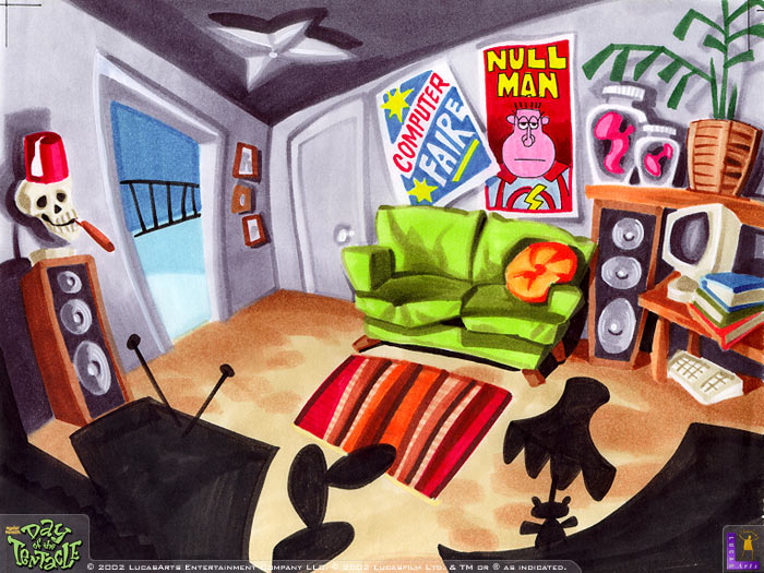
They’ve already said they’re rummaging the vaults at Lucas, but who knows what has been thrown to trash during the years.
Scroll down a bit and them images are so vibrant good.
Holy crap, I’m excited for this. I’m super excited to hear what they do with the music and curious if they have the original DAT recordings of the VO sessions. Remastering the VO game assets would be pretty brutal because there’s a looooot of degradation there in the original release since it’s so lo-fi.
Arkhangel: The House of the Seven Stars - http://www.winternightgames.com
You are here: Home → Forum Home → Gaming → Adventure → Thread