Adventure Gamers - Forums
You are here: Home → Forum Home → Gaming → Adventure → Thread
Post Marker Legend:
-
 New posts
 -
 No new posts
Currently online
Why remakes have inferior graphics compared to the original?
I know, you’re propably right about that it isn’t meant to look pretty, but it could at least look aesthetically pleasing. Now it’s just looks like a paper cut collage made by a first grader.
Ugly looking doesn’t mean unappealing.
Really, what’s the story? I suppose hand-drawn, classic 2D graphics is dying, which could be one of the explanations, but still… I thought about in the light of today’s news that more screenshots of Day of the Tentacle will be revealed later today.
Monkey Island 1


You can’t compare the graphics of 2 games in a 20 years span… Well, we can! The first one was a revolutionary, “near-art” concept for its time, and the second one is just a so-so. Higher resolution means little.
As others have said, the remake of Monkey Island 1 has terrible character design.
I don’t know what they were thinking by making the characters so distorted and ugly.
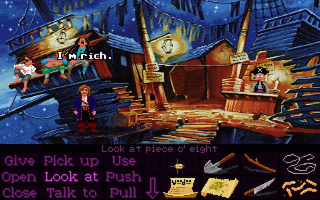
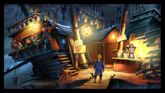
Pirate in bar—new version
Pirate in bar—old version
Elaine—new version
Elaine—old version
Elaine—old EGA version
The original is also clearer—For example, look at how well the glasses on the guy in the coat show up in the original compared to the remake. And the colors in the remake look muddy compared to the original.
Monkey Island 2
Monkey Island 2 is probably the closest thing that came to mimicking the original, but it still feels one step below the art of the original especially in terms of lightning, and somewhat “stiff”, resembling the Flash-based graphics.
Yes the lighting looks “like a computer did it” rather than a real artist.
The result looks washed out.
Larry 1


Yes, compared to the VGA version it’s in SVGA, but I deliberately added Larry 7 in there - because it’s not better than those graphics, and it SHOULD be, more than 15 years after it.
I actually think the background in the still screenshot of the Larry remake looks very good. However the characters sort of stand out against the background, where in the original they blended in—probably because the background has shading where the characters do not. In the original, the characters do have some shading.
256 color games often have a more intense look than high resolution games.
I’m not sure if this is inherent to using 256 colors or whether it’s due to artists being better back when 256 colors was the maximum number.
Screenshot of apartment in original BS1
Screenshot of apartment in “Director’s Cut”
Screenshot of apartment in BS5.
I think the Broken Sword games all look good—at least in the still shots.
Another post on modern graphics -
this is Daedelic’s stock “old man” they have been using for the past 4 or 5 years

There are about 5 or 6 “old men” characters in Anna’s Quest and they all look 80-90% similar to this guy, which makes them hard to distinguish. They have very little style on their own. Again, compare this to Lucasarts games where every character was so distinctive and you couldn’t possibly confuse them.
Now, Anna’s Quest is a pretty good game but the graphics are just so bland and styleless. Every recent Daedelic game (except maybe Fire and Memoria) uses the same style. Why? Think how different Monkey Island and Day of the Tentacle were using 256 colors and low resolution.
Another post on modern graphics -
this is Daedelic’s stock “old man” they have been using for the past 4 or 5 years
There are about 5 or 6 “old men” characters in Anna’s Quest and they all look 80-90% similar to this guy, which makes them hard to distinguish. They have very little style on their own. Again, compare this to Lucasarts games where every character was so distinctive and you couldn’t possibly confuse them.
Now, Anna’s Quest is a pretty good game but the graphics are just so bland and styleless. Every recent Daedelic game (except maybe Fire and Memoria) uses the same style. Why? Think how different Monkey Island and Day of the Tentacle were using 256 colors and low resolution.
As far as Anna’s Quest goes Oscar you are, quite simply, wrong in blaming Daedelic with regard to the graphics. They are an accurate follow on from the original chapter one released a number of years ago, long before Dane Krams (the creator) got involved with Daedelic.
Life is what it is.
Did I blame Daedelic? No.
Did I blame Daedelic? No.
No?
Now, Anna’s Quest is a pretty good game but the graphics are just so bland and styleless. Every recent Daedelic game (except maybe Fire and Memoria) uses the same style.
Butter my buns and call me a biscuit! - Agent A
Didn’t you block me? ![]()
Anyway that statement still applies to Deponia and other recent Daedelic games. There’s no reason for them all to use the same style, and for the Anna’s Quest characters to look so similar. This is a trend in many modern adventure games.

No it doesn’t. All Daedelic did for Anna’s Quest was colour. Everything else was done by Dane Krams. As for the artstyle, you may not like it (which is fine), but that doesn’t make it bad.
Recently completed: Game of Thrones (decent), Tales from the borderlands (great!), Life is Strange (great!), Stasis (good), Annas Quest (great!); Broken Age (poor)
Didn’t you block me?
PM yes, forum no. ![]()
Anyway that statement still applies to Deponia and other recent Daedelic games.
So you do blame Daedalic.
Butter my buns and call me a biscuit! - Agent A
No it doesn’t. All Daedelic did for Anna’s Quest was colour. Everything else was done by Dane Krams. As for the artstyle, you may not like it (which is fine), but that doesn’t make it bad.
And once again, I’m not interested in assigning blame. You might be, but leave me out of that discussion.
I never said ‘I don’t like it therefore it’s bad’. I admit I don’t like it, but that isn’t why I said it was bad. For that you can refer to my original post above. You’re welcome to rebut it, just don’t bring in strawman arguments like me assigning blame.
Here you go:
“Now, Anna’s Quest is a pretty good game but the graphics are just so bland and styleless. Every recent Daedelic game (except maybe Fire and Memoria) uses the same style.”
Recently completed: Game of Thrones (decent), Tales from the borderlands (great!), Life is Strange (great!), Stasis (good), Annas Quest (great!); Broken Age (poor)
Sorry to unearth an old topic, but I found this interesting and thought some of you could like it, but I didn’t know where to put it. It seems to fit well with the subject here (except that it’s just the contrary?)
Yup, Shape Up or Slip Out is one of the ugliest Sierra games ever made. It’s just dreadful collection of textures snapped from photos and poorly constructed “whimsical” architechture.
But also one of the two best games. Love for Sail being the other.
For whom the games toll,
they toll for thee.
Nostalgia is a hell of a drug, both original MI also look better to me but I doubt many people playing them for the first time now would use the retro mode.
The Larry remake didn’t look bad in screenshots, I think the problem were the animations.
I’ve got a hint of deja vu here from an earlier post on the thread:
Nostalgia is a hell of a drug, both original MI also look better to me but I doubt many people playing them for the first time now would use the retro mode.
The Larry remake didn’t look bad in screenshots, I think the problem were the animations.
Edit: GeorgyBoy’s dodgy link removed from his quote!
You are here: Home → Forum Home → Gaming → Adventure → Thread