 07-15-2006, 11:17 AM
|
#1 |
|
Lazi
Join Date: Sep 2005
Posts: 393
|
http://www.revfans.com/news.php?id=72
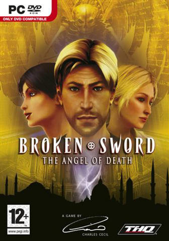 So it's from different art people than BS3  still can't accept why the characters (nico and george) look so different from last time (but going from 2d to 3d was ok for me) still can't accept why the characters (nico and george) look so different from last time (but going from 2d to 3d was ok for me)
__________________
Lazi happy burnt bread |

|

|
07-15-2006, 11:32 AM
|
#2 |
|
The Reggienator
Join Date: Sep 2003
Location: Vaasa, Finland
Posts: 5,519
  |
That's as ugly as the final Broken Sword 3 cover was.
__________________
"The old standby, that never got old in the first place. We come back to them weekly, nightly, for hours at a time--and they always deliver. They are pure, timeless, and often taken for granted." - Nick Breckon - Shacknews My gamesale list *updated 26.8.2007* Hey, dear people please buy my games, I need money to conquer Europe! Or do something similar. |
|
|
|
07-15-2006, 11:41 AM
|
#3 |
|
Retired Buccaneer
Join Date: Jan 2004
Location: Florida
Posts: 779
|
That is bad. There's far too much yellow in the picture, which is not easy on the eyes, and rather boring visually. Plus the characters' heads are taken directly from the in-game models.
I seriously hope this is just a placeholder image that Revolution released until the real cover is finished... but I can't be sure. Man, do I miss the days when you could buy big boxes, with lush paintings on the cover like the ones Steve Purcell did... 
|
|
|
|
07-15-2006, 11:57 AM
|
#4 |
|
Irritant F0rum Beasty
Join Date: Jan 2004
Location: Just lurking...
Posts: 990
|
Not good.
Plus what's with the signature? 
__________________
Disclaimer The Seed accepts no responsibility for any damage that my have been caused to your Hard Drive as a result of viewing this post! |
|
|
|
07-15-2006, 12:25 PM
|
#5 | |
|
The Dartmaster
Join Date: Sep 2003
Location: San Rafael, California
Posts: 3,084
 |
Quote:
The new character designs still irk me but that box isn't that offensively bad. People complain and nitpick too much. Compare it to some atrocities like the Escape From Monkey Island box and all is well. That BS4 design is perfectly servicable.
__________________
When on the Internet, visit Idle Thumbs | Mixnmojo | Sam & Max.net | Telltale Games "I was one of the original lovers." - Evan Dickens |
|
|
|
|
07-15-2006, 12:36 PM
|
#6 |
|
Rattenmonster
Join Date: Sep 2003
Location: San Francisco
Posts: 10,404
|
DVD-ROM, eh? I find that more interesting than the box art itself.
I wonder if that's just for Europe or if it'll have a DVD release in North America, too. The publisher's the same, so we can hope... |
|
|
|
07-15-2006, 12:55 PM
|
#7 | |
|
The Thread™ will die.
Join Date: Jan 2004
Location: United Kingdom
Posts: 22,542
  |
Quote:
 . .I actually quite like this box art. And having the designer's signature there is cool. |
|
|
|
|
07-15-2006, 01:28 PM
|
#8 |
|
Headbanger
Join Date: Sep 2003
Location: The North
Posts: 2,233
|
I think it looks good. Not exactly breathtaking but not dreadfully ugly either. Although I think that the covers of the 3 previous games looked much nicer (and that includes BS3 as well although that's the least attractive of the three).
__________________
NP: Botanicula, Catherine, Dear Esther, Okami |
|
|
|
07-15-2006, 01:50 PM
|
#9 |
|
The Reggienator
Join Date: Sep 2003
Location: Vaasa, Finland
Posts: 5,519
|
Well, yes that signature is something that is quite nice and a bit rare in todays industry.
__________________
"The old standby, that never got old in the first place. We come back to them weekly, nightly, for hours at a time--and they always deliver. They are pure, timeless, and often taken for granted." - Nick Breckon - Shacknews My gamesale list *updated 26.8.2007* Hey, dear people please buy my games, I need money to conquer Europe! Or do something similar. |
|
|
|
07-15-2006, 01:56 PM
|
#10 |
|
Senior Member
Join Date: Jul 2005
Location: Norway
Posts: 541
|
I think it would look better with just the angel on the cover. No need to stick the faces of every main character in the front.
The signature is a nice touch, though.
__________________
Replaying: The Black Mirror Just finished: Day of the Tentacle, Broken Sword - Director's Cut To play: Black Mirror 2 |
|
|
|
07-15-2006, 02:29 PM
|
#11 | |
|
Adventure Game Elitist
Join Date: Dec 2005
Location: Uruguay
Posts: 831
|
Quote:
I don't mind the signature one way or the other.
__________________
Currently Playing: Heroes of Might and Magic III: Armageddon's Blade Currently Reading: Guards! Guards! "El tiempo me enseñó que la miseria es culpa de los hombres miserables; que la justicia tarda y nunca llega pero es la pesadilla del culpable." - Lo Que El Tiempo Me Enseñó |
|
|
|

|
07-15-2006, 07:41 PM
|
#13 | |
|
Super Moderator
Join Date: Nov 2004
Location: Ohio
Posts: 8,907
|
But how it looks on a shelf is important. If someone is browsing and something catches their eye, they are more likely to pick it up and take a look at it.
I actually like the yellow. In the sea of black and occasional white boxes, that will really stand out. I found this article on the use of color in advertising: Quote:
|
|
|
|

|
07-15-2006, 09:20 PM
|
#15 |
|
Grah! Grah!
Join Date: Oct 2005
Posts: 509
|
Nico looks okay to me, but yeah, George really doesn't look right. The whole direction of this game frightens me; from the title to the art style it all seems to be trying a bit hard and really quite a departue from the rest of the series. I hope I'm proven wrong though.
|
|
|
|
07-15-2006, 10:01 PM
|
#16 | |
|
Member
Join Date: Mar 2006
Posts: 49
|
Quote:
 This box art looks kinda boring to me... But I'd still buy the game if it's at least as good as BS3. |
|
|
|
|
07-16-2006, 12:00 AM
|
#17 |
|
Psychonaut
Join Date: Jan 2004
Location: Edinburgh
Posts: 5,114
|
The box art is ok.
I like the "A Charles Cecil game" tag at the bottom. For too long the publishers (and or brand name) tend to get the credit for the games. The BS3 box has a big THQ logo and only mentions Revolution on the back. Does anyone really know who makes the FIFA games. It's nice to see a director type mention on the front similar to movies.
__________________
I'm not insane, my mother had me tested! |
|
|
|
07-16-2006, 12:55 AM
|
#18 |
|
The Reggienator
Join Date: Sep 2003
Location: Vaasa, Finland
Posts: 5,519
|
I was just recently checking that Telltale CSI game at a supermarket and i thought it was kind of strange that there is no mention of Telltale in the whole box, except for a small company logo at the back of the box, I mean a really SMALL picture of the logo.
Developers should indeed get more credit for the games that they have made.
__________________
"The old standby, that never got old in the first place. We come back to them weekly, nightly, for hours at a time--and they always deliver. They are pure, timeless, and often taken for granted." - Nick Breckon - Shacknews My gamesale list *updated 26.8.2007* Hey, dear people please buy my games, I need money to conquer Europe! Or do something similar. |
|
|
|
07-16-2006, 01:39 AM
|
#19 |
|
Senior Member
Join Date: Jun 2005
Location: UK
Posts: 227
|
I bet there's a standard Photoshop file for doing these awful front covers. It probably has 4 layers:
Layer 1: Insipid Prince of Persia 'adventure' background' Layer 2: Character faces Layer 3: Title with 'Bought in' font. Layer 4: Information gumph. All THQ front covers look this bad, it's their standard front cover. |
|
|
|
07-16-2006, 04:39 AM
|
#20 |
|
Junior Member
Join Date: Aug 2005
Posts: 24
|
I miss the artistics and stylish 2D-covers. Ah well.
The yellow does make you notice it. I guess it's ok. But if I weren't a Broken Sword-fan, I would read what's back careful before desiding if buying the game. I liked the Runaway box art wery much. |
|
|
|
|
Powered by vBulletin® Version 3.8.11
Copyright ©2000 - 2024, vBulletin Solutions Inc.
Copyright ©2000 - 2024, vBulletin Solutions Inc.


