A Look at Graphics: Character Design in Silhouette
A Look at Graphics
Acclaimed artist Ben Chandler shares his expertise in designing adventure game graphics.
Character design – especially in low resolutions – is something that really interests me, particularly because I'm not very good at it. Before joining Wadjet Eye Games, most of my character design relied on highly stylized anatomy, bright colours, comical outfits and interesting postures. When I suddenly found myself faced with the prospect of trying to draw people that looked a bit more human, for more serious, believable settings, everything I'd come to rely on was suddenly of very little use. In order to examine the art of character design a little more deeply, I want to strip away the colours, the details, the expressions, and focus on the raw silhouettes, or outlines, that make up characters. That way we can analyze one very specific aspect of the art form, without other elements distracting us too much.
(Click on any image for a larger version)
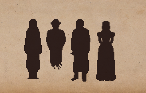
My first work with Wadjet Eye was on the Blackwell series, starting as character artist and animator, and it was a task I was poorly equipped to handle. The very first character I had to draw, Rosa Blackwell, took me many, many attempts and edits. When it came to drawing her spectral sidekick, Joey, things went much smoother, and I managed to get a workable design very quickly.
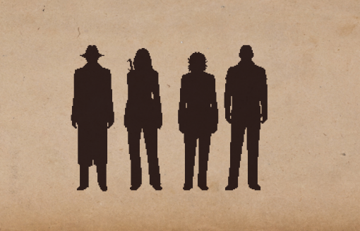
The reason behind this is mainly the iconic style of Joey, compared to Rosa's much more everyday appearance. Getting Rosa to look correct in the eyes of her writer, Dave Gilbert, involved countless tiny edits, with him trying to explain why it wasn't quite right. Knowing what made Rosa feel like Rosa was a very subtle thing, in other words. Joey, on the other hand, was much easier to distil. A certain kind of hat, the hands tucked in the pockets, and the series trademark floaty area in place of ghostly legs meant that I could easily tell what made him work. These differences are visible even from the silhouettes – simply put, Rosa didn't give me much to work with. Even seen here in pure silhouette, Joey is at least recognizable as a vaguely lumpy version of himself, while Rosa looks like a Coke bottle that's had an unfortunate accident. Other characters – a cigarette smoking, trenchcoat wearing detective, or an ancient spirit dressed in an antique gown – gave me similarly distinctive features to work from, and small elements of these features are still visible in this most basic form.
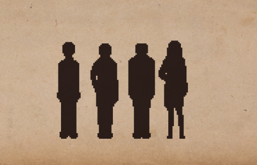
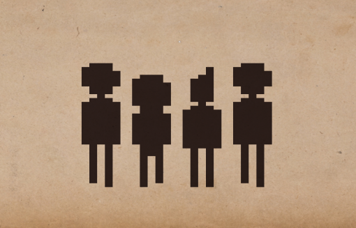
Technobabylon was, if anything, perhaps slightly more difficult. Working on main character sprites that were even smaller left me with little room to experiment, and the result is a very stiff set of silhouettes that don't look very anatomically representative of a human, nor do they look all that special. James Dearden's detailed outlines of the characters' biographies provided plenty of insight into what made them work, but in terms of visuals, there were few props, few accessories to work with that allowed me to give them interesting shapes – except for some of the many, very colourful and intriguing NPCs. The fourth character here represents an attempt at something more relaxed and normal, but is hindered by both my poor anatomy skills and the small size.
This game actually has a range of very compelling minor characters who were quite dynamic to draw, and it definitely went more easily with them. It's these main characters, however, that we're looking at for most of the game, and in terms of interesting designs, my work on them can largely be considered disappointing.
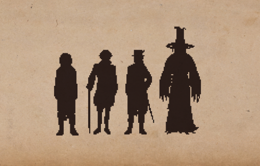
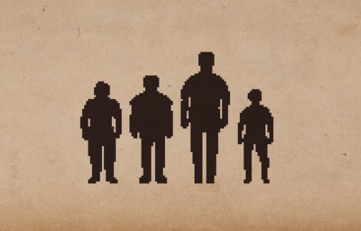
When it came to my next project, Shardlight, things changed quite a bit. Designer Francisco Gonzalez and I agreed between us that we wanted slightly bigger character sprites, giving me more pixels to play with. Francisco's ideas for the characters involved fairly elaborate costumes and attitudes, which allowed for quite a lot of exaggeration, making for some much more iconic silhouettes. Certain elements I toned down – the third character here originally had a much larger hat in his design – whereas other elements were exaggerated. The last character involved me taking one of Francisco’s sketches and really running with it, resulting in a silhouette that really stands out. The second character represented above is basically unchanged from his sketch – I merely took his outline and gave it appropriate colouring and shading, then animated it, such was the clarity of his vision for this particular character's outfit and posture.
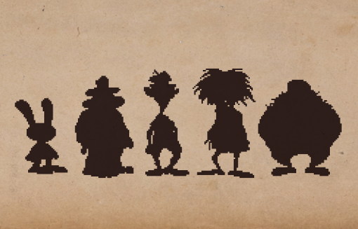
My current project, working again with Dave Gilbert, sees us using a slightly higher resolution yet again, and here I finally feel like I have enough pixels to start approaching some semblance of realism, while still trying to keep interesting silhouettes as a goal. Here you can see slight differences in stance, props, outfits and body shape, the benefits of having more pixels to play with. I'm working with less exaggerated, theatrical character types than those in Shardlight for these main characters, although once again, the game certainly has its share of more iconic shapes in the lesser characters.
The main thing, though, is that I'm trying to use these silhouettes to not only suggest who these characters are, via their outfits and props, but also to give a sense of mood – relaxed, less stiff postures, that are quickly identifiable as human. I still like to think there's enough diversity in their designs that they feel unique, and even identifiable, despite a more everyday approach to clothing and anatomy.
When studying character design from the genre's history, there's definitely a point where technology wasn't advanced enough to allow for very complex designs. These characters from four beloved classics are almost comical in how similar they are – a result of the AGI engine's limitations. That being said, there's one character whose design stands out, with a blocky little feather in his cap that identifies him to us as Graham of Daventry. The fact that we can recognize one of these figures among such basic, blocky shapes speaks volumes about the power of having an iconic silhouette. A strong, distinctive character design should be readable from the outline alone, at least to some extent. This is why it's useful to simplify these designs into their basic silhouettes – it stops the colours and textures from distracting us from the basic, fundamental design of a character, and allows us to see what in that character's form makes it stand out, if anything.
If we skip forward in time to Sierra's SCI engine, we can see that things have gotten much better in terms of detail. These are at least representative of human figures, if quite low resolution ones, and start to look a little more unique. Keeping with realistic anatomy, similarity in body types, and a lack of props, however, means it's quite difficult to determine who any of these characters might be, without a fairly intimate familiarity with the games. Knowledgeable Sierra fans will no doubt pick up on the small details that give away certain clues, and some will probably even be able to identify all four of the characters, but those who have only patchy experience with the company's games, such as me, will hardly be able to distinguish these characters from their outlines alone.
On the much, much more cartoony side of the spectrum, LucasArts's adventures featured character designs whose silhouettes are so uniquely stylized that I've no doubt that even people who haven't played their respective games, but have at least a passing familiarity with the genre's history, will not only know where these characters come from, but probably be able to name most of them, too. This is the strength of a strong, unique silhouette – it creates characters that are both memorable and easily identifiable. It's why it's so easy to merchandise Mickey Mouse, Batman, and The Simpsons – one glance at even the most stylized representation of these characters, and we know exactly who they are.
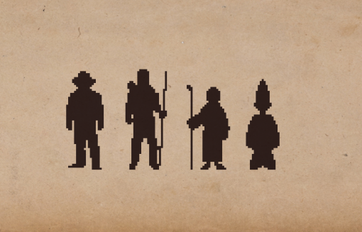
If we want to create bold, memorable silhouettes without going so far into cartoony territory, there are a few things we can try. Take, for example, Indiana Jones here – the trademark hat and confident pose capture his character from the films well, in just the smallest number of pixels. Robin Hood beside him features enough props that even if we don't recognize who he is, we can tell we're looking at a man of action, and read his character type just from the silhouette. Bobbin Threadbare's hooded robe and distaff are integral parts of his character, too, helpful props that not only act as his sole identifying features, both in silhouette and in full detail, but are also fundamental parts of who he is and will become. Simon the Sorcerer's robe and wizard hat turn him from a fairly ordinary English schoolboy into someone who's at least reasonably recognizable, despite his very small size.
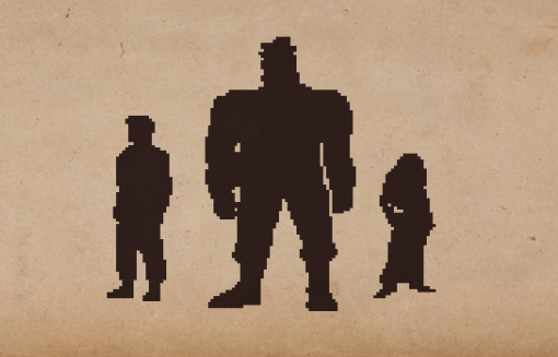
The ability to read a character's attitude, their lifestyle, or even just identify who they are at a glance are excellent things to aim for in a low resolution sprite, and looking at these old characters, in all of their blocky glory, and trying to understand what makes their silhouettes work is an interesting goal. Sometimes it can be the smallest things – I'd recognize the way that The Dig's characters’ puffy astronaut pants tuck into their boots anywhere. In other cases it's the whole design – Ben Throttle's massive frame, outfit and broad stance embody his lifestyle and his character with every pixel. Perhaps it's just the way a character stands, too – Kyrandia 2's Zanthia goes through an incredible 13 outfits over the course of a single game, yet her posture – and therefore her outline - remains recognizably her in every iteration of her design.
It's silhouettes like these that I aspire to recreate in my own work. Usually I simply try to keep outlines in mind while drawing a character, one of the various ‘guides’ that I will check a piece of art against to see if works well, a measure of its success or failure. However, in a situation where I have to design a character of a very specific, exaggerated type – say, for instance, a hulking, violent monster – I will often start from a pure, blank silhouette similar to the ones you see in the example images here, and in that way hopefully imbue the design with this sort of idea from the very foundational stages, before I start thinking about colours and details. So my preferred practice changes depending on the specific circumstance, but either way, it’s always an important element to consider so that my characters, too, can be instantly recognizable and readable from the most rudimentary of visual detail.
Ben Chandler is an acclaimed adventure game artist and designer who now works with Wadjet Eye. If you enjoy his freelance article series at Adventure Gamers, we encourage you to check out his equally insightful blog about art in games.
