
Adventure Gamers - Forums
You are here: Home → Forum Home → Gaming → Adventure → Thread
Post Marker Legend:
-
 New posts
 -
 No new posts
Currently online
Time Heist - Community feedback for scenes/backgrounds
Time Heist, the first game being developed by indie game dev team 5¼ Games, will be a 2D point-and-click adventure game, well rooted in the beloved traditions of the genre. The narrative of Time Heist will send the player on a journey through time, on a quest to thwart the efforts of a mysterious figure who is causing havoc on the natural course of time. We have chosen to build Time Heist on top of the Unity game engine.
Teaser poster for Time Heist:

The story will be set in the historically rich island nation of Malta, a tiny landmass at the heart of the Mediterranean Sea, which has inherited much from several historically significant powers, such as the Romans, Knights Hospitaliers, British and French Empires, Fatimid Arabs, and even Normans.
Malta!

As our first outing in the world of adventure game development (and indeed, game development in general), we would like to be active in involving the adventure gamers’ community in the development process. We have been learning that, though exciting and very interesting, game development is also a hugely iterative or cyclic process.
This is us ![]()
![]()
Very often the product of each iteration would require evaluation and feedback; sometimes the product is put through more iterations, other times it is discarded altogether. We’ve figured that the stage at which we put the results through this process of evaluation/feedback would be a great place from where to start involving the community.
Not really how video games are developed…

More specifically, we have recently started producing the background artwork which we will end up being integrated in the very first scenes of the game. Though we know what scenes we want (since we have the narrative already established) we still find ourselves wanting to establish a visual and layout direction which would be most appropriate for a point-and-click adventure game of this sort. We are in the process of reviewing the results of our work ourselves, but we are also really keen on sharing these results with the community over here, and hearing what you guys and gals have to say about them!
#1: Classroom scene (hi-res)

#2: Classroom scene, less grit/lighting. (hi-res)

#3: Alternative classroom scene. Unshaded scenes like this one will eventually be shaded. (hi-res)

#4: Bathroom scene (hi-res)

#5: Alternative bathroom scene (hi-res)

#6: Corridor scene (hi-res)

#7: Alternative corridor scene (hi-res)

#8: Office scene (hi-res)

#9: Alternative office scene (hi-res)

#10: Alternative office layout option (hi-res)

#11: Alternative office layout option (hi-res)

#12: Janitor’s quarters (hi-res)

#13: Alternative janitor’s quarters (hi-res)

#14: Proposed layout of home scene (hi-res)

Feel free to speak your minds about the stuff we have posted here. Do they appeal to you? Which scenes strike you as most interesting? Which layouts do you prefer? Can you suggest any layout, perspective or stylistic changes? And if so why? Which scenes do you think would serve the needs of a traditional 2D point-and-click adventure game? These are a few of questions a game designer should ask himself when evaluating his game. We’d really appreciate your feedback, suggestions and criticism on what we’ve been able to share with you so far!
The art style definitely appeals to me. My first thought on seeing it was, “Darwyn Cooke is doing art for an adventure game? COOL!” ![]()
These covers from “New Frontier” are why I thought that. I really liked them, too.
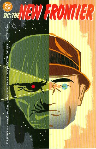
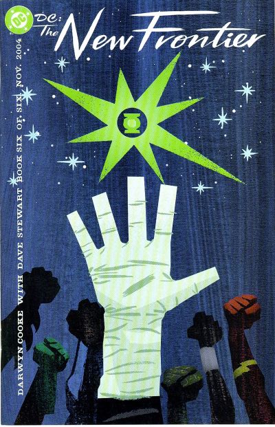
So artwise, you’ve got me interested.
Interesting artwork, it’s cartoony and playful, yet stylish and detailed. Would fit a humourous game best. It is going to be humourous or at least semi-humourous (à la Indiana Jones or Broken Sword for instance), isn’t it???
Out of the artwork posted, I have the following comments:
#1 - Classroom scene: at first glance there’s a tad too much lighting and WAY too much grit.
#2 - Classroom scene - less grit/lighting: the lighting and grit is better on this one, but in comparison to #1, the contrast between all objects and colours seems too much. Especially that jacket at the bottom in the middle: the contrast between the white ruffles on the cape, the light blue and the orange/brown desk is slightly straining on the eyes for me.
#3 - Alternative classroom scene: looks absolutely perfect to me! It’s the kind of screenshot where I’ll savour the artwork first before continuing with the game.
#4 - Bathroom scene: same as #3, looks really great, and having the characters in colour adds another layer to it…
#5 - Alternative bathroom scene: I really like the artwork, but I don’t like the colours used. As in #2, the contrast between different colours looks to be too high. The picture actually looks better if I tilt my laptop screen somewhat so I get a darker image…
#6 - Corridor scene: I’m sensing a trend here. Contrast between the trees and the corridor is too much, and the black railing posts could really use more colour (unless those are still works in progress?). The entire colour palette looks better if I tilt my screen and get a darker image.
I’m not a graphical artist, so I’m not sure how much my opinion is actually worth, but could the contrast problems I’m having (some of those adjacent colours really strain my eyes), have anything to do with the lack of outline for the objects? Because…
#7 - Alternative corridor scene: this looks again like a massive improvement. So far I’m thinking black-and-white is the route to go for the artwork!
#8 - Office scene: this one I like better in terms of colouring. I’d probably prefer the alternate lay-out of #10 for this scene, because it’s a bit more up-close, and I like how it’s slightly askew compared to #8, #9 and #11.
#9 - Alternative office scene: again I like the artwork better in black-and-white. The entire thing seems to gel more, and it adds a slight ‘noir’ vibe to the game (I’m not sure if the story warrants that?)
#12 - Janitor’s quarters: looks great! ![]()
#13 - Alternative janitor’s quarters: looks a lot better than the earlier coloured screens, presumably because of the more subdued colours. The yellow parts are still in progress, I reckon?
#14 - Home scene layout: looks great, no gaps in the screen, and gives an appearance of being lived in, coupled with a fun style.
Based on all the screenshots shown, my guess would be to go for the black-and-white backgrounds and coloured characters.
The artwork and style are really interesting, imo (the artist knows what he’s doing). But like I said: it seems to work better in black-and-white, or with very subdued colours. Bright colouring doesn’t seem to fit the style, despite it being somewhat cartoony.
All in all: looks very promising, imo. A lot of potential! ![]()
Just my two cents…
The truth can’t hurt you, it’s just like the dark: it scares you witless but in time you see things clear and stark. - Elvis Costello
Maybe this time I can be strong, but since I know who I am, I’m probably wrong. Maybe this time I can go far, but thinking about where I’ve been ain’t helping me start. - Michael Kiwanuka
Thanks for your replies guys!
The art style definitely appeals to me. My first thought on seeing it was, “Darwyn Cooke is doing art for an adventure game? COOL!” Wink
Yes the art style we are going for at the moment does seem to be similar to the images you posted, Mister Ed. We’ve had many reactions to this visual style, most of which, so far, have been positive, so we are really thrilled about this ![]()
Interesting artwork, it’s cartoony and playful, yet stylish and detailed. Would fit a humourous game best. It is going to be humourous or at least semi-humourous (à la Indiana Jones or Broken Sword for instance), isn’t it???
One of the things we are trying to bring out in Time Heist is a tribute to adventure games of old. Most of the members on the team are, in fact, old-school adventure gamers, and as such, we understand and appreciate the humor which was often delivered by the genre. So expect to see traces of such funniness in the game ![]()
#7 - Alternative corridor scene: this looks again like a massive improvement. So far I’m thinking black-and-white is the route to go for the artwork!
We were always thinking of colouring the scenes in, but we will consider toning down the colour. Perhaps it would be a good idea if we reserve brighter or more vibrant colours for characters and interactible items, so that they stand out of the scene better. Apart from being more aesthetically pleasing, it might outright eliminate the problem of ‘pixel-hunting’ when looking for items to interact with.
All in all: looks very promising, imo. A lot of potential! Thumbs Up
Thanks for the encouragement TimovieMan! And for your detailed look into the BGs; very much appreciated as well!
The art style looks like Broken Age, but better. The office scene in #8 is the prettiest of the bunch, and hits just the right color scheme for me… If I was to nag a little bit, I’d like if the “straight lines and rectangle” drawing style like in Dirty Split (though to a lesser extent) could be toned down a little bit in the favor of a more traditional “free hand-paint”.
As for the grit-lighting issue, I really liked the #1, but seeing number #2 it’s more suitable for a majority of scenes, so I’d like if you could make the middle-ground between the two.
Recently finished: Four Last Things 4/5, Edna & Harvey: The Breakout 5/5, Chains of Satinav 3,95/5, A Vampyre Story 88, Sam Peters 3/5, Broken Sword 1 4,5/5, Broken Sword 2 4,3/5, Broken Sword 3 85, Broken Sword 5 81, Gray Matter 4/5\nCurrently playing: Broken Sword 4, Keepsake (Let\‘s Play), Callahan\‘s Crosstime Saloon (post-Community Playthrough)\nLooking forward to: A Playwright’s Tale
The art style looks like Broken Age, but better. The office scene in #8 is the prettiest of the bunch, and hits just the right color scheme for me… If I was to nag a little bit, I’d like if the “straight lines and rectangle” drawing style like in Dirty Split (though to a lesser extent) could be toned down a little bit in the favor of a more traditional “free hand-paint”.
Well that’s certainly flattering diego, thanks! Yeah, we do not want to go as “straight lines and rectangle” as what you’ve shown us in Dirty Split, though it is interesting in its own right as well. We’ll see where the changes we will be adopting over the coming few weeks will take us stylistically, since we still are in the relatively early stages of defining our own styles and choosing which ones to continue along with; which is precisely why we appreciate the community’s feedback on these scenes! Thanks!
I took a look at the screenshots from another computer (and thus another screen), and this time the colours looked a lot better and the colour contrasts a lot less straining. Differences in screen technology and brightness/contrast settings matter a lot.
In that regard: #1 actually looks a lot better than #2 this time around, but I agree with diego that a middle ground for the grit/lighting issue would probably be preferable.
#8 has great colouring!
Personally, I still prefer the style used in the black-and-white pictures (especially the bathroom scene - #5 is not that good imo, and you can hardly see the sinks on the left in it).
Will be interested to see the direction you guys will take the graphics in…
The truth can’t hurt you, it’s just like the dark: it scares you witless but in time you see things clear and stark. - Elvis Costello
Maybe this time I can be strong, but since I know who I am, I’m probably wrong. Maybe this time I can go far, but thinking about where I’ve been ain’t helping me start. - Michael Kiwanuka
I think it’s a good idea to completely avoid one-point perspective, when possible. One-point perspective can make a scene quite boring, but give it a just a slight angle, like you did in “#10: Alternative office layout option”, and it immediately becomes more interesting to the eye. Offcourse, this can be difficult if you need visible doors on two opposite walls (though there are ways around it), but in general, I think it’s a good rule to not use one-point perspective when creating adventure game backgrounds. Apart from that, I think your artwork looks very good! ![]()
Duckman: Can you believe it? Five hundred bucks for a parking ticket?
Cornfed Pig: You parked in a handicapped zone.
Duckman: Who cares? Nobody parks there anyway, except for the people who are supposed to park there and, hell, I can outrun them anytime.
We are experimenting with a more subdued colour scheme on the backgrounds. The aim is to be able to draw attention to characters and interactible objects, which might also lend to a better gameplay experience. Here are a couple of the backgrounds which were previously uncoloured, but now have been given color using this more subdued palette.
#15: Principal’s office and bathroom, subdued colour scheme (hi-res)

Personally, I still prefer the style used in the black-and-white pictures
Can these latest images be considered kind of a middle ground between the black-and-white style (which, though very interesting and artistic, might not be really suited for the experience we want to deliver), and the vibrant style of images #1, #2 and #8? Do you still prefer the earlier versions?
in general, I think it’s a good rule to not use one-point perspective when creating adventure game backgrounds. Apart from that, I think your artwork looks very good!
Thanks Dag! This observation is very interesting, and I think very valid. I think it takes some experience to be able to compose scenes with a creatively different perspective, but the result would be a more engaging and ‘playful’ environment, and that is one of the aspects we’d like to work into many of our scenes.
Can these latest images be considered kind of a middle ground between the black-and-white style (which, though very interesting and artistic, might not be really suited for the experience we want to deliver), and the vibrant style of images #1, #2 and #8? Do you still prefer the earlier versions?
Nah, these are great. Still need some shading to make the objects stand out more (the toilets especially), but they look great…
But I’m just one opinion, you don’t need to change the style of your game based on what I say…
The truth can’t hurt you, it’s just like the dark: it scares you witless but in time you see things clear and stark. - Elvis Costello
Maybe this time I can be strong, but since I know who I am, I’m probably wrong. Maybe this time I can go far, but thinking about where I’ve been ain’t helping me start. - Michael Kiwanuka
I am an artist myself, and work as an art professor for a living. Additionally, I’ve done background art and animations on a number of adventure game projects. I think the overall style here is lovely. The art direction is slick, attractive, and most importantly, consistent. Personally, I think the more colorful images are nicer—the subdued palette in these latest versions makes them feel very much like period images (film directors often use similarly subdued palettes in World War II movies nowadays—see Band of Brothers as a classic example. It’s meant to mimic the feel of colorized black and white photos, I think.) If that’s what you’re going for, mission accomplished, but personally I think the brighter palette fits better with the cartoonish stylization of the renderings. Additionally, I like the images with the added lighting, atmosphere, and textures. They feel deeper and more fleshed out with those added elements.
I see what Dag is saying about certain kinds of perspective feeling blander, but I think it’s okay if you’re going for an “old school” adventure game vibe. It’s not necessarily the fact that they are in one-point perspective that is an issue, it’s more that the vanishing point is dead center, which usually results in all furnishings and objects being parallel to the bottom of the screen, and kind of gives the scenes a bit of a hallway effect. If it’s only a few scenes that are like that, it’s fine, but in general, a greater variety of angles can enhance the dramatic impact of the images. Remember, compositions set along strong diagonals will always feel more dynamic and interesting than compositions set along horizontals or verticals. That’s just a simple fact of how the human brain interprets two-dimensional images.
Anyway, everything looks great here so far; the most important thing is that you pick a direction and stick to it—consistency is the most important feature of good art direction. So far, it looks like you’re well on your way to that, so kudos. ![]()
You are here: Home → Forum Home → Gaming → Adventure → Thread
