A Look at Graphics: In Defense of Inconsistency
A Look at Graphics
Acclaimed artist Ben Chandler shares his expertise in designing adventure game graphics.
“The most important thing to remember when doing graphics for a game, regardless of art style, is that the elements remain consistent.”
This is a great piece of advice I've seen given to beginners, and most likely given it myself. Keeping a game's art style consistent will help a project feel cohesive to players, allow the atmosphere of any scene to remain uniform, and make for a more polished, professional feeling project.
Rules like this in art are especially interesting, because they both provide excellent guidance and also give cause to investigate why this rule exists, and why it might be wrong in certain scenarios. I want to suggest that breaking this (and other) rules of art is a wonderful thing to try – partially because it's fun to be contrary and annoy the people that like making up rules, but mostly because the subversion of particular expectations or standards can have memorable, practical or just funny results. Creating moments like these is a primary goal of an artist, and therefore being inconsistent can be a very powerful tool.

Click any image for a gallery of larger versions
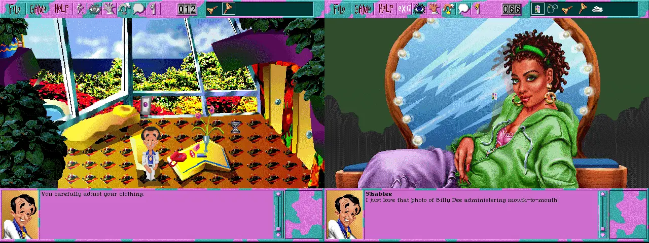
There's definitely a very strong case to be made for consistency, though. My first experience working with Wadjet Eye Games was doing art for the last couple of games in the Blackwell series. Notable in that each of the five titles had a different art team working on them, my efforts to 'fit in' with the style established in earlier titles initially resulted in Rosa looking like a denim-clad bean with spectacles (a character sprite that is, thankfully, lost to time). Numerous edits later, and we settled on the slightly awkward bobbleheaded version that Deception (fourth image above) sported – a strange hybrid between what had been my own style previously and what I thought was a decent approximation of the earlier styles in the series.
Epiphany (far right) was notably easier for me, as no longer was I trying to remain consistent with someone else's style. Here I was trying to make a better version of a style I'd already worked in, and the process was much less painful. The fact that I'd taken over the background art role helped, too, with my characters and backgrounds meshing more naturally simply because of a consistency in approach with regards to details and colours. The result still looks slightly varied, and overall the series has the odd feature of each game looking quite noticeably different from the others. I think this is eased, somewhat, by the extremely low resolution of these titles, which allows most people to regard them as 'pixel art games' and ignore the inconsistencies both in style and skill.
So as a general rule consistency makes sense, but as I said, inconsistency can be an interesting thing. We've already covered the topic of creating other dimensions with art in this series, and being inconsistent can really bring about a mood change. I praised the wonderful dimension shift in Grim Fandango at the time, and the inconsistency of that scene with the rest of the game is one of the loveliest approaches to such a thing. By embracing it as a feature, the game owns this as a style, and breaking rules willingly brings about the memorable and funny results I promised earlier.
Another example of artists changing style on purpose can be seen in Leisure Suit Larry 6. Most of the game features a grotesquely drawn Larry wandering around garish scenes with a tacky brutality of colours and angles to explore, which captures mid ‘90s advertising campaign design unfortunately well. The ladies whose affections Larry seeks to win, however, are drawn in a much more pleasant style. It seems that the artists were keeping Larry's goal in mind, and that in order for someone with Larry's character depth to find someone appealing, they should conform to fairly traditional beauty standards. It's an interesting juxtaposition of styles that constructs a set of goals designed to be easy to sympathise with and understand from Larry’s point of view, and also develops a clear contrast between the character of Larry and the people he meets.
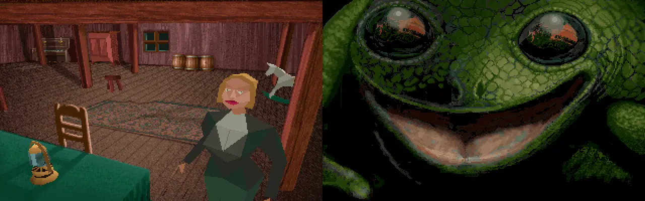
One really fun example of a marked difference in style is in Alone in the Dark. Why, for example, does a startled frog's face receive more detail than the main characters? Ostensibly one can easily dismiss this as a by-product of technology, with which static elements were easy to render in great complexity and dynamic ones were not, but the game already featured a similarly low detail model for the frog. Clearly the developers felt that doing a more explicit close-up of the frog was warranted, adding something more to the game's introduction than the animation of it leaping could provide. Conveying extra emotion through the characters, meanwhile, is done mostly via the gameplay and the range of camera angles, meaning that the low detail model works perfectly well – handsome and detailed close-ups aren't necessary if you have players directly trying to avoid the attentions of foul creatures themselves.

Aside from aesthetic reasons, there are practical reasons for having inconsistencies in a style. Proponents of 'pixel art' speak at great length about the importance of having consistent pixel sizes within a piece, and usually I'd agree that this is very helpful. In a dialogue-heavy game such as The Darkside Detective, however, the pixels are so large that rendering text in a font that matched the rest of the game would be entirely impractical and illegible. Keeping the character and environment pixel sizes consistent while using a font with much smaller pixels means that the many fine jokes can be more easily read. As always in games, the practicality of being able to play the game should take precedence over any aesthetic principle such as this.
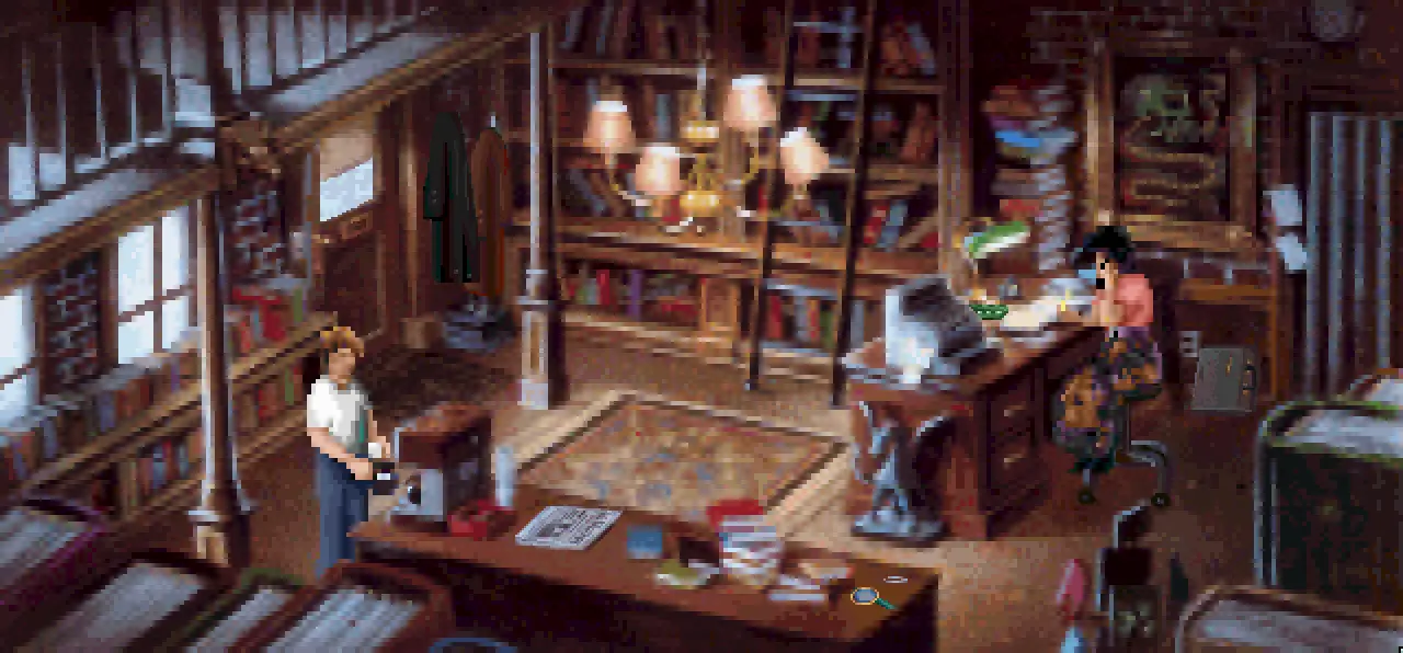
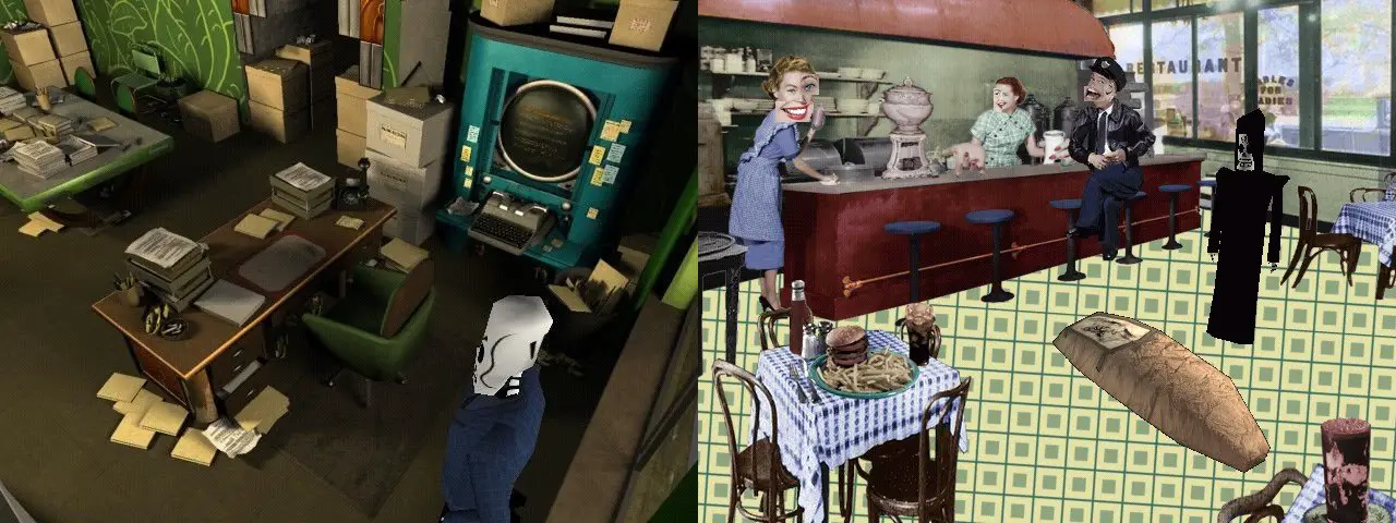
Of course, it's pointless defending inconsistency in art without admitting the places in which it actively hurts a title. The SVGA version of Gabriel Knight is a great example of where a nitpicky artist who has spent too many hours staring at massive pixels will be put off immediately. Notice how certain items in the image – the newspaper, coffee pot, and magnifying glass, for example – are drawn in much finer detail than the rest of the scene. In theory, having higher resolution graphics is a great thing, but having one quite finely detailed newspaper next to a pile of much blockier, blurrier books just looks like a mistake, and ruins the immersion for me. For the average player this might not be an issue, but to me as an artist looking for inspiration within the works of others, this is hard to deal with.
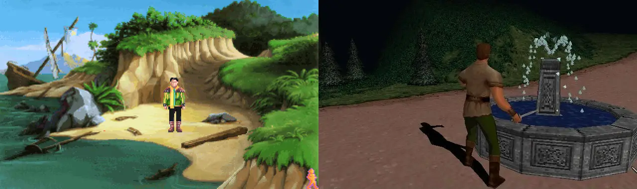
Inconsistencies within a series can hurt, too. The middle King's Quest games managed to maintain the colourful, whimsical feel of the original titles while still managing to add in more detail, realism and atmosphere. Even the considerably divisive seventh game stays true to the appearance of a fairytale brought to virtual life, despite the clear aspirations towards a more childlike cartoon approach. Mask of Eternity, however, loses this charm and is instead rendered in a bleak, drab world of blocky 3D. Compare the blue skies and warm, sunlit grass of the first shot here to the oppressive colours of its neighbour. It's hard to imagine these games being connected in any way.
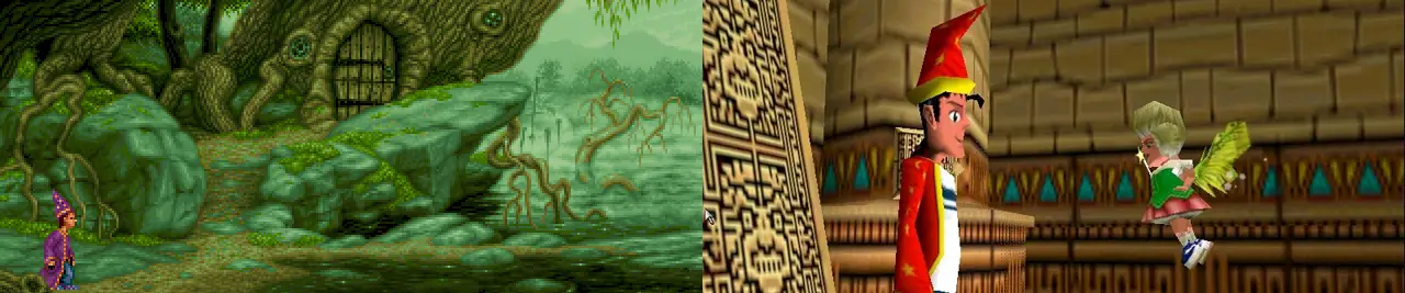
It's not just colours, either. The palette choices in Simon the Sorcerer 3D aren't too dissimilar to those of its predecessors, but the weird, blocky aesthetic it sports simply doesn't feel right next to the carefully detailed scenery and animations that came before. Perhaps this can simply be put this down to the perils of moving from 2D to 3D before the technology could properly support it, as Telltale's take on Sam & Max five years later is a good example of a series featuring low resolution 2D being followed by a higher resolution 3D game that still manages to capture its original aesthetic well. Still, it was a deliberate design decision to go this route, and the series suffered greatly for its radical, ill-advised change.
Every element in visual arts is a tool, and a tool can both improve and ruin the piece you are working on. Just as a hammer wielded incorrectly can yield disastrous results, inconsistencies in visual style can be extremely damaging. There's a reason people preach against it, and it's definitely a good policy to strive for consistency overall. As always, though, the exception to a rule exists for a reason. As with any creative discipline, a rule broken with a sensitivity towards the effect that breaking said rule will create empowers the artist to steer a game's style in particular ways. Consistency, or the absence thereof, isn't a right or wrong way to approach visual art. Instead, it's a discipline to be studied, examined and experimented with, and a very effective tool to have in one's collection.
Ben Chandler is an acclaimed adventure game artist and designer who now works with Wadjet Eye. If you enjoy his freelance article series at Adventure Gamers, we encourage you to check out his equally insightful blog about art in games.