 09-04-2005, 03:54 AM
|
#1 |
|
Member

Join Date: Nov 2003
Location: ~Kuwait~
Posts: 73
|
You can find this logo on the new Battlefront II site
here personally ,, i think it sucks. It's like a kiddie company or something. This new logo just even lowers the company's place in the market. Man, LucasArts, you probably just start digging your grave like you were supposed to last year. --5abanja out P.S It'd be real nice if someone could actually post the logo since I don't know how to 
Last edited by 5abanja; 09-04-2005 at 04:01 AM. |

|


|
09-04-2005, 06:56 AM
|
#7 |
|
Elegantly copy+pasted
Join Date: Jan 2005
Posts: 1,773
|
Ug-leeee!
...Though probably no worse than the old logo, cave drawing-style. I remember hating it before I came to associate it with quality adventure games. Now it's too infused with nostalgia to evaluate dispassionately. . . . No, I think the new one is worse after all. The way those curves connect, so that the figure could be constructed from two arcs or two wavy lines. Bad. The blobby mess of a torso caused by too many lines and shapes interacting. Bad. The way the lines get so thin they fade into the background. Bad. The cheesy drop shadow. Bad. The way the arms, head and... err, parachute? seem to form a freaky eye of Sauron. Bad (though true of the old logo as well). The way the pose seems to invite us to kick the dude in the groin. Bad. I do like what they've done with "LucasArts," on the other hand. Modern and classy, yet reminiscent of the classic LucasFilm logo.
__________________
Please excuse me. I've got to see a man about a dog. |
|
|
|
09-04-2005, 07:10 AM
|
#8 |
|
Citizen of Bizarro World
Join Date: Mar 2004
Location: Htrae
Posts: 4,219
|
Me no likey. This logo doesn't seem like he'll be able to perform cool lightsaber tricks and shoot out lightining like the old one.
__________________
By no rocket’s blue shade am no shells dead down there, Gave no proof all day long that the flag was unwhere! No say does am spar-strangled shroud hang limply! Under land of no free! Am us home coward-leeee! ~Excerpt from the Bizarro Anthem |
|
|
|
09-04-2005, 07:17 AM
|
#9 |
|
Puts the 'e' in Mark
Join Date: Sep 2003
Posts: 3,138
|
The old logo was a pretty detailed illustration type thing, so it's no surprise they'd eventually choose to simplify it. The new logo is not the best ever, but it's alright. I like the typography a lot and I guess I can get used to the new gold guy.
Now all they need is some games that aren't Star Wars and aren't utter shite, which realistically isn't going to happen. |
|
|
|
09-04-2005, 07:46 AM
|
#10 |
|
El Luchador
Join Date: Sep 2003
Location: Denmark
Posts: 1,629
  |
As long as it's animated to do something wicked in every game, I think the new gold guy will be fine.
Agree about typography. Nothing but awesome, really.
__________________
Use Verb On Noun - Adventure game inspired illustrations |
|
|
|
09-04-2005, 08:51 AM
|
#11 |
|
Retired Buccaneer
Join Date: Jan 2004
Location: Florida
Posts: 779
|
To echo everybody else, I don't like the new Gold Guy as much as the original, but am fine with the text logo underneath.
Although if LucasArts really did want a simpler logo design, I think they should've just reused this old idea: 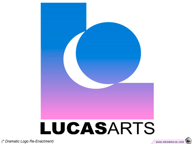 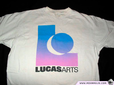 That one may be less attractive, but at least it wouldn't remind us of all the classic adventure games bearing the mark of the Gold Guy. 
|
|
|
|
09-04-2005, 09:44 AM
|
#13 |
|
The Thread™ will die.
Join Date: Jan 2004
Location: United Kingdom
Posts: 22,542
   |
I don't think that it's particularly bad or good. It may not draw out deep feelings of nostalgia, but it's also not a terrible image.
|
|
|
|
09-04-2005, 10:42 AM
|
#15 |
|
The Reggienator
Join Date: Sep 2003
Location: Vaasa, Finland
Posts: 5,519
|
Yeah, that ain't a bad logo.
Just that the games that come with that logo most likely are going to be bad. 
__________________
"The old standby, that never got old in the first place. We come back to them weekly, nightly, for hours at a time--and they always deliver. They are pure, timeless, and often taken for granted." - Nick Breckon - Shacknews My gamesale list *updated 26.8.2007* Hey, dear people please buy my games, I need money to conquer Europe! Or do something similar. |
|
|
|
09-04-2005, 10:59 AM
|
#16 | |
|
Ale! And keep 'em coming!
Join Date: Oct 2004
Location: Beyond the Pattern of Reality...or Germany
Posts: 8,527
|
Quote:
Just notice how the site icon is still the old gold guy. -
__________________
- "esc(x) cot(x) dx = -csc(x)!" Dennis added, and the wizard's robe caught on fire. "Gosh," Dennis said, "and some people say higher math isn't relevant." >>>Inventor of the Mail order-Assassin<<< And *This*...is a Black Hole - BYE! |
|
|
|

|
09-04-2005, 12:44 PM
|
#18 | |
|
The Thread™ will die.
Join Date: Jan 2004
Location: United Kingdom
Posts: 22,542
|
Quote:
 . .
|
|
|
|
|
|
Powered by vBulletin® Version 3.8.11
Copyright ©2000 - 2024, vBulletin Solutions Inc.
Copyright ©2000 - 2024, vBulletin Solutions Inc.


