Home  Adventure Forums
 Gaming
Adventure
CMI Demo/Game Cutscene Comparison, and Alternate Credit Design
Gaming
Adventure
CMI Demo/Game Cutscene Comparison, and Alternate Credit Design
 09-10-2006, 12:10 PM
|
#1 |
|
Retired Buccaneer
Join Date: Jan 2004
Location: Florida
Posts: 779
|
I've been busy all morning and afternoon whipping up a new page on The Curse of Monkey Island. Check it out and let me know what you think.
Personally I like the original opening credits backgrounds more than the final versions. Plus the mermaid is cool--pity management made them remove it. 
|

|

|
09-10-2006, 12:36 PM
|
#2 |
|
gaybrush threepwoody
Join Date: Sep 2003
Posts: 1,567
  |
You always impress ATM. This is one of my favourite games so it's extra special to see all the cool stuff you dug up. Great work!
I agree! The mermaid is pretty lovely. |
|
|
|
09-10-2006, 12:42 PM
|
#3 |
|
The Reggienator
Join Date: Sep 2003
Location: Vaasa, Finland
Posts: 5,519
  |
Very nice, thanks for the page on CMI!
 The mermaid screen looks really nice...
__________________
"The old standby, that never got old in the first place. We come back to them weekly, nightly, for hours at a time--and they always deliver. They are pure, timeless, and often taken for granted." - Nick Breckon - Shacknews My gamesale list *updated 26.8.2007* Hey, dear people please buy my games, I need money to conquer Europe! Or do something similar. |
|
|
|
09-10-2006, 12:43 PM
|
#4 |
|
gaybrush threepwoody
Join Date: Sep 2003
Posts: 1,567
|
I would like to add that I particularly enjoyed your look at LucasArt's logo progression. Did you know that a design pal of mine, Grant Peterson, developed the LucasArts logo? He lives here in San Francisco. My friend Mark's design firm "Sequence.com" represents some of his identity work and you can see the LucasArts logo proudly displayed in the portfolio.
link to ATM's LucasArts logo analysis link to Sequence.com edit : well I guess they removed the LucasArts logo from the site! woops. They made room for all of the newer stuff. Last edited by eriq; 09-10-2006 at 12:53 PM. |
|
|
|
09-10-2006, 12:47 PM
|
#5 | |
|
Retired Buccaneer
Join Date: Jan 2004
Location: Florida
Posts: 779
|
Quote:
|
|
|
|
|
09-10-2006, 12:50 PM
|
#6 |
|
gaybrush threepwoody
Join Date: Sep 2003
Posts: 1,567
|
The original gold guy logo. Here is Grant's website (no portfolio online)... maybe if you email him and ask him nicely, he'd be willing to show us some cool early LucasArts logo stuff. He's a really amazing designer.
http://grantpeterson.com/ This is the logo he did: 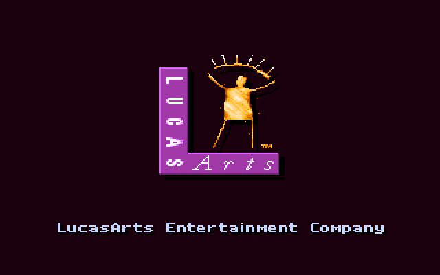
|
|
|
|
09-10-2006, 01:30 PM
|
#7 |
|
Senior Member
Join Date: Aug 2005
Location: Santa Barbara, CA
Posts: 3,038
|
Great work, ATMachine, as always!
I actually prefer the credits as they were in the final game, though I also wish they'd kept the mermaid.
__________________
Currently reading: Dune (F. Herbert) Recently finished: Harry Potter and the Prisoner of Azkaban (J. K. Rowling) [++], La Nuit des Temps (R. Barjavel) [+++] Currently playing: Skyrim Recently finished: MCF: Escape from Ravenhearst [+], The Walking Dead, ep. 1 [+++], Gray Matter [++] |
|
|
|
09-11-2006, 05:43 AM
|
#8 |
|
Retired Buccaneer
Join Date: Jan 2004
Location: Florida
Posts: 779
|
I've pasted the CMI credit titles into the old backgrounds to give a better impression of how the original credits idea might have looked.
I'm probably not going to add them to the CMI page, so I'll just post them here. Dial-up users be warned!    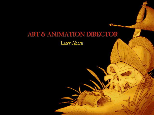 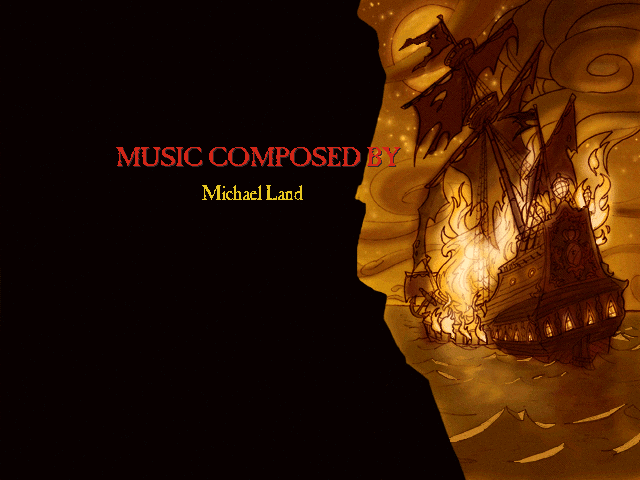 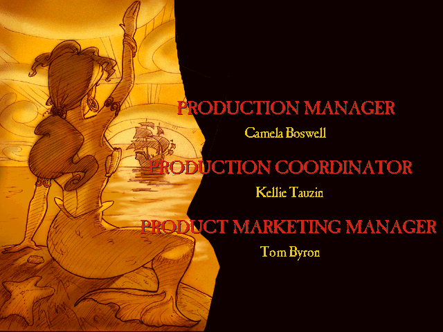 The credits on the last one are my guess as to what was intended for that background. I base that on 1) the position of the credits on the screen in the final game, and 2) the fact that the mermaid has a cameo as a ship's figurehead in the background when those titles appear. |
|
|
|
09-11-2006, 10:07 AM
|
#11 |
|
Kersal Massive
Join Date: Sep 2003
Location: Manchester
Posts: 1,430
|
Cool stuff ATM. I think I prefer the final version of the credits, but the original images are nice too. Wonder if they'd have faded in and out like the MI2 credits?
LeChuck's overhaul is interesting - his new eyes are more sinister, but his new teeth less so! Looks like they had already made the less detailed teeth standard in every other shot, though, so it makes sense for them to be consistent. |
|
|
|
09-11-2006, 10:27 AM
|
#12 |
|
gaybrush threepwoody
Join Date: Sep 2003
Posts: 1,567
|
Definitely like the final titles better. Monkey 2's map pieces were more "rough" and looked more fitting. Since the Curse map pieces are higher-res and more "crisp", they don't look quite as cool. The full page page looks nicer.
|
|
|
|
09-11-2006, 10:35 AM
|
#13 | |
|
Retired Buccaneer
Join Date: Jan 2004
Location: Florida
Posts: 779
|
Quote:
Of course, his eyes are red with normal-colored whites on the MI2 box art, so... who knows? Last edited by ATMachine; 09-11-2006 at 10:42 AM. |
|
|
|

|
09-18-2006, 01:08 PM
|
#16 |
|
Retired Buccaneer
Join Date: Jan 2004
Location: Florida
Posts: 779
|
In a similar vein of Monkey Island demos, I've finally put together a page on my site about the MI2 rolling demo I helped to crack open years ago. The SCUMM Bar once had an article about some of the changes made betwee the demo and final game, but my page goes much more in-depth.
|
|
|
|
09-18-2006, 02:20 PM
|
#17 |
|
gaybrush threepwoody
Join Date: Sep 2003
Posts: 1,567
|
The insane detail you go into just boggles my mind. You should write a book about all of these findings or something. Great work! Let me know if you ever need any help designing a worthy splash page for your website. I would love to do one complete with a fancy title and sound effects.
"ATMachine's Classic Adventure Game museum of oddities and rare findings" serious! PM me. And we need to get you your own hosted domain. I can help with that. |
|
|
|
|
Powered by vBulletin® Version 3.8.11
Copyright ©2000 - 2024, vBulletin Solutions Inc.
Copyright ©2000 - 2024, vBulletin Solutions Inc.


